Red attracts attention. It demands it, really. In design, it is the color of energy, romance and raw vitality. Incorporating red into your living space requires more than adding paint. You change the atmosphere. But there’s a fine line between bright accents and visual assault. Used correctly, it brightens up your room. If used in large quantities, there is a risk that your sanctuary will turn into a stress zone.
Why Red Works (and When It Fails)
The main reason homeowners shy away from red is its strength. It is not a passive color. It moves towards the viewer. This is perfect for drawing attention to a particular architectural feature or focal point. Think red walls behind the bed or a bold red kitchen island. These applications lay the foundation for your space.
However, the danger lies in saturation. Red increases heart rate. Covering all surfaces creates an aggressive look. This color is not suitable for small windowless rooms where silence is required. It is most effective when balanced.
Balance problems
Most DIY businesses make the mistake of trying too big or too fast. They painted all four walls. Alternatively, cover all the cushions with dark red. The energy becomes overwhelming here. The key is moderation. I want the red to feel intentional and not accidental.
“The color red should be an exclamation point within the intended sentence, not the entire paragraph.”
Practical tips for using red
- Start small: Test the color of a pillow, rug or piece of art before painting. Let’s see how it interacts with natural light.
- Combine with neutral colors: Combine red elements with black, white, gray or wood tones. These neutral backgrounds let the red shine without drawing attention.
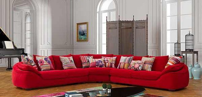
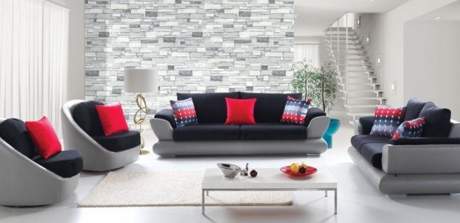
- Use this as a highlight: Focus on one or two areas. red front door. The gray living room has a red one-seater sofa. This creates a dynamic focal point without saturating the entire space.
- Think about the purpose of the room: The color red is exciting in the kitchen and dining area, it encourages conversation and appetite. Use it sparingly in the bedroom or bathroom so it doesn’t disturb your relaxation.
Necessary materials and tools
If you want to bring red into your home, just paint is not enough. Consider it. Matte red paint looks flat and muddy. Semi-gloss or satin surfaces reflect light better and add depth to the color.
For textiles, choose fabrics that are resistant to color. Velvet gives red a luxurious feel, absorbs light and creates a rich, deep shade. By using cotton or linen, the colors remain bright and relaxed. When choosing furniture, take into account the color of its background. Warm reds (with orange undertones) go well with warm woods like oak. Cool reds (bluish colors) go better with cool grays and metals.
Safety is also important. Ensure adequate ventilation during painting. Red pigments can be very strong. Use a mask when sanding or handling old materials that may contain lead. When it comes to lighting, avoid using warm yellow bulbs on bright red walls. Colors may be distorted and appear muddy or orange. Use a neutral white light to keep the red bright.
Where to start?
you did it
Combination of red and gray or neutrals
Red is loud. Be careful. If you want that energy without the headache, you have to ground that energy.
Gray is the best friend you never knew you needed.
Shades of slate, charcoal and cool concrete. The contrast of red and gray instantly de-clutters. It feels very modern. sophisticated. It’s more like “Luxury Loft” than “Valentine’s Day”. No need to worry about colors anymore. You let it breathe.
Then it’s wood.
Both red and the color of wood have a history. Think mid-century modern. Think of your 1970s kitchen. It brings warmth that cannot be experienced with metal or plastic. Walnut or oak? Both are valid. Particles add structure and break up red solid blocks. Prevents the space from feeling like a candy wrapper. It’s like you’re living inside it. Retro.
Red needs a partner. Gray gives structure. Wood gives it soul.
Don’t miss the white and cream.
You can’t just paint everything red and expect it to look good. your eyes will quit. Introducing white. Bright and fresh white decoration. Or add cream to soften. Cream forgives. It is warmer than pure white. it balances the intensity. This is a visual exhalation.
If you want to do this yourself:
- test samples before committing. Light changes everything.
- If you are nervous, use the 60-30-10 rule. 60% neutral. 30% red. 10% accent.
- Matte finish hides imperfections. The shiny red color indicates flaws in your prep work.
Where do I start? Accent wall. Or maybe some throw pillows. Don’t destroy the kitchen cabinets from day one.
The psychology of red: how color affects your home
Red is more than just a color. This is a statement. It demands attention.
When you bring it into the room, the atmosphere changes immediately. Aggressive in some situations, attractive in others. The trick is knowing where to place it for best effect. Most people are afraid of it. They were afraid it would flood the space. But when used correctly, it adds warmth and energy without looking cluttered.
Why red is good for the kitchen
Let’s start with the kitchen. This is probably the best place to for bold color.
Red has an appetite-increasing effect. This is a physiological reaction. Your body associates this tone with urgency and energy. In the kitchen, it means a warm and inviting atmosphere. It creates a wonderful atmosphere in your room. Not chaotic, but alive.
Think of a traditional Italian restaurant. The walls are often painted in a dark terracotta or rust color. The food tastes better, or so they say. Part of this is psychological. The environment prepares you.
If you are renovating, consider an accent wall. Or maybe a statement appliance. An old-fashioned red refrigerator works wonders. It anchors the room. It catches the eye. You don’t have to paint all the walls bright red. Just feeling the heat is enough.
Boosting Focus in Study Spaces
Next, go to your library or home office.
Here, red has a different purpose. Stimulates thinking. It wakes up the brain. This shade helps when you can’t concentrate. The heart rate rises slightly. It keeps you alert.
However, proceed with caution. Too much red in the workplace can cause anxiety. It is very stimulating. Use with caution.
A red desk lamp. A few throw pillows on the reading chair. One bookshelf is painted a dark, atmospheric red. These touches can stimulate creativity without causing disruption. It’s all about balance. You need energy, not agitation.
Creating Intimacy in Social Areas
Cafes and social lounges thrive in red.
Why? Because it encourages discussion. Color promotes closeness. It lowers inhibitions slightly. People feel more comfortable sharing their stories when surrounded by warm red tones.
Imagine a cozy bistro. The lighting is dim. The walls are dark red or burgundy. The music is low. You stay longer. You talk more. This atmosphere pushes you towards connection.
At home, this applies to dining or living areas for guests. Turn a classic gathering into an intimate event. Make people linger. It makes them feel welcome.
Practical Application
So how do you incorporate this into your space?
Don’t just paint one wall. Think about textures. The matte surface absorbs light and creates a deeper red color. The glossy finish reflects this and makes it pop even more.
Use natural materials for grounding. Wood floors. Stone countertops. These organic elements soften the intensity of the red color. This prevents the space from feeling sterile or too dramatic.
And safety? When painting, make sure there is good ventilation. Red pigments can be very strong. Take your time. Mix the shades carefully.
Intention is the key. Red shouldn’t be an accident. It should be a choice. Take intentional action to change the mood in your home.
Strategic use of red in residential design
Red is aggressive. Be careful. Place it anywhere and your living room will look like a traffic cone. You have to manipulate it.
Kitchen Cabinets
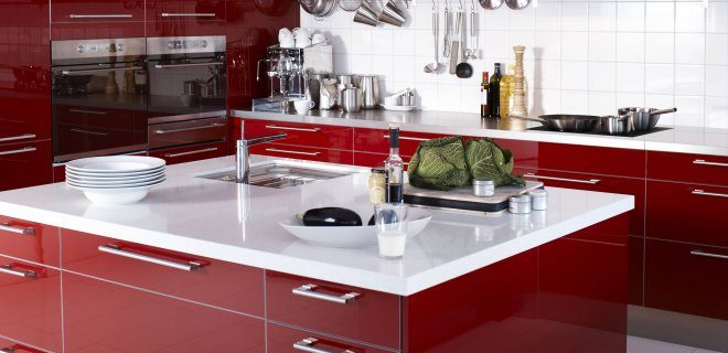
Let’s start with the kitchen. A brave choice. Red cabinets change the energy immediately. It is loud. It is warm. It makes you feel like you’re cooking rather than a sterile lab.
But here’s the problem. Balance required. Pair these red units with cool tones. white worktop. gray island Household appliances made of stainless steel. This contrast prevents the room from feeling like a fever dream. Use a semi-gloss surface to make cleaning easier, as red will show oil stains faster than you’d like.
The atmosphere and romance of the bedroom
Move to the bedroom. Here red is difficult. Too much can raise blood pressure. You can’t sleep.
Just use it as an accent. Velvet headboard. Silk pillowcase. Place the blanket at the foot of the bed. This creates a romantic and atmospheric atmosphere without turning the sanctuary into a boxing ring. The goal is intimacy, not adrenaline.
“Red makes your heart beat faster. Use it to express passion, not panic.”
Living room energy booster
What is the main residential area? An anchor is required.
Instead of painting all four walls, include accent pieces. Definitely don’t do this. A red leather sofa. It looks very luxurious. It ages well. Or if you are renting, pay attention to the accessories. A red armchair. Heavy curtains. Bright carpet.
These products add positivity without requiring a complete overhaul. They are movable. You can change your mind later.
Balance the heat
Red is very heavy. It draws the eyes down. Light is needed so that the space does not look small.
- Pair with neutrals: Pair red with beige, cream or soft gray walls.
- More texture: Wood tones warm the red. Think oak or walnut.
- Lighting matters: Use warm white lamps (2700K–3000K). Cool blue light makes red look muddy.
You don’t paint walls. It creates an atmosphere. A red chair can save a boring living room. A red kitchen can characterize a home. Use it wisely. The rest of the room can be quiet. Let the red speak.