
Most homeowners think of the bedroom as just a place to crash. It isn’t. It is a sanctuary. A retreat. A place to decompress after a day that felt like it lasted a century. But if your room looks like a generic showroom, it won’t feel like a refuge. It will just feel like another box in the house.
You can change that. You can’t buy “calm” at the store. You have to build it. It starts with a theme. Not a cookie-cutter Pinterest board, but a vibe that matches your headspace. Do you need the quiet isolation of a Parisian attic? Or the warm, breezy chaos of an island getaway?
Here is how to pick the right direction and execute it without blowing your budget or sanity.
Finding Your Vibe: From Cozy to Exotic
Deciding on a style is the hardest part. Once you know what you want, the rest is just logistics.
Comfortable and Cozy
This isn’t about buying expensive furniture. It is about texture. Think heavy knits, soft linens, and fabrics that invite touch. If you close your eyes, does the room feel like a hug or a interrogation? Go with what feels good. Neutral tones work, sure. But so do warm, earthy tones. The goal is sensory comfort.
Island Getaway
This theme is popular for a reason. It mimics a vacation state of mind. To pull it off, you need light colors—whites, sandy beiges, and ocean blues. Use natural materials. Driftwood accents. Rattan baskets. Sheer, flowing curtains that catch the breeze. It is about creating an escape within your own home.
Parisian Styling
French sensibility is less about the Eiffel Tower and more about romance and refinement. Think wrought iron bed frames. Mirrors with ornate gold or silver frames. Floral patterns, but subtle ones. The mood is romantic. It is sophisticated. It feels like you are sipping espresso while watching the rain.
Pink and Pretty
For a girl’s room, pink is a classic. But not every shade works. Avoid the neon hits. Look for dusty rose, blush, or magenta depending on the energy you want. Pair it with frills, lace, and plenty of soft lighting. It should feel fun. Playful. A space for a daughter or a young woman to express herself.
Faux Painting
Want luxury without the price tag? Try faux finishes. You can mimic marble, wood grain, or textured plaster with paint and simple tools. It adds depth. It adds character. It transforms a boring wall into a feature. Just practice on a spare piece of drywall first.
Traditional European
This style leans on history. Dark woods. Ornate moldings. Heavy drapes. It feels grounded. Serious. If you like the idea of a home that feels like it has been standing for a hundred years, this is your lane.
Relaxing and Casual
Sometimes you don’t want fancy. You want easy. Casual bedrooms use soft colors, comfortable seating, and minimal clutter. It is an oasis. Miles away from the rest of the house. The pace slows down.
Master Bedroom Strategy: Make It Work for You
Your master bedroom should be more than a sleeping pod. It is a multi-functional zone. A place to read. To think. To meditate. Or to watch a movie.
Lighting and Space
If your room is small, light colors expand it. Use filmy curtains to let in light. They make the space feel airy. If the room is huge, cozy it up. Use warm tones like raspberry or periwinkle. Add patterns. Gingham. Toile. Stripes. Break up the emptiness.
Furniture Placement
Don’t just shove big pieces into the center of the room. Station them parallel or perpendicular to the walls. This maximizes every foot of space. It creates flow. It prevents the room from feeling cramped.
Nightstand Height
This is a critical detail people get wrong. Your nightstands must be level with the top of your mattress. Do not fumble in the dark for your phone or alarm clock. That is frustrating. That ruins sleep. If your current nightstands are too low, swap them or add risers.
Adding Character
Need storage? A quirky flea-market chest can hold extra blankets. It adds history to the room. It’s a conversation piece. For scent, use a miniature muslin bag stuffed with rosemary or lavender. Toss it in a drawer or linen closet. It prevents mustiness. It smells like nature. Not chemicals.
Personal Touches
Include what makes you content. Family photographs. A desk for work. A sound system. Don’t feel pressured to keep it minimalist. A room with personal artifacts feels lived-in. It feels like home.
Kids’ Rooms: Design for Growth
Kids grow fast. What works for a toddler is useless by age eight.
Neutral Foundations
Choose neutral colors and wallpaper that can adapt. Skip the bunnies. Go for small-print wallpaper. It is timeless. It doesn’t scream “baby” when they are teenagers.
Durable Furniture
Buy furnishings that
If you’re in the middle of a remodel, don’t wait until the kids are older to think about safety. Install childproof electrical outlets now. It takes two seconds and saves you from tearing up drywall later.
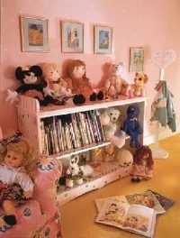
Storage is where these rooms live or die. Built-in bookcases and dressers are the anchors. They stay put. They hold stuff. But you also need flexible solutions. Shelves. Window seats with pullout drawers. Cubbyholes for the small, lost things.
Shaker pegs keep coats off the floor. Plastic bins corral the chaos. It’s not sexy, but it works.
Zoning the Play Area
You need distinct zones. Don’t just dump toys on the floor.
Designate a vinyl confetti-print floor for the play area. Vinyl resists scuff marks. It wipes clean. It handles the spillage of juice boxes and the trample of toy trucks.
Then, create an island of carpet. This is for quiet pursuits. Read. Draw. Hide. Add a ton of floor pillows. Make it soft. Make it a retreat from the noise.
Lighting matters here too. Skip the floor lamps. They’re trip hazards. They get knocked down. They take up valuable square footage.
Look to wall sconces. Recessed lighting. It keeps the floor clear. For walls, avoid the babyish stuff. Framed maps. Antique animal prints. Posters. These add visual interest without screaming “toddler zone.”
Teens’ Rooms: Privacy First
Teens need a private hangout. This is their sanctuary. Use their favorite colors. Pick sensible furnishings.
The bed is the center of their universe. It’s where they talk on the phone. It’s where they lounge with friends. It has to be comfortable.
Simple bedding is key. A duvet. A minimum number of pillows. This encourages them to actually make the bed. Or at least, to have a bed that can be made.
Twin beds are practical. They fit sleepovers. They fit small rooms. They need not match. Paint them the same color if you want consistency, but keep the styles different. Upholster the headboards. Or use stencils.
Mismatched linens keep separate beds from looking sterile. Try yellow-and-white-checked sheets with a red bedskirt on one bed. On the other, flip it. Red-and-white-checked sheets with a yellow skirt. It’s upbeat. It’s intentional.
Wallcoverings can mimic decorative painting techniques or their favorite fabric. Denim. Denim wallpaper is cool for girls’ or boys’ rooms. It’s durable. It’s trendy.
Workspaces and Organization
A teen needs a place to work. Call in modular units customized with shelves and drawers. Or find a flea-market desk and refurbish it with paint. An antique table works too.
Install shelves nearby. Books. Papers. Supplies.
A large bulletin board is a good catchall. Photos. Sports schedules. Reminders.
And for the chair? Get an ergonomically designed office chair. Their backs will thank you. A young back doesn’t need to be punished by cheap, rigid seating.
Guest Rooms: The Basics
Guest rooms are about necessity. Comfortable bed. Good reading light. Place for clothes.
Don’t overcomplicate the storage. A portion of the closet works. An antique coat rack. A stretch of simple Shaker pegs. Privacy is non-negotiable.
For entertainment, move in a tiny television. A compact disc player. A stack of magazines. Keep it simple.
Add welcoming extras. A pretty drinking glass on a tray by the bed. A basket of fresh fruit for late-night nibbling. A soft throw. And don’t forget a stack of plump towels. Nothing says “welcome” like a fresh, fluffy towel.
No Space for a Guest Room?
If your home doesn’t allow space for a full-time guest abode, get creative.
Consider a sleeping area in your home office. Install a modular unit that features a fold-down bed. It disappears when not in use.
Other solutions include boat- or railcar-style berths. Faithful futons. Or the summer winner: an enclosed porch.
Hang delicate sheers on rods in front of the porch screens. Or suspend yards of diaphanous muslin above the bed. It enhances the fanciful feeling of sleeping outdoors. It’s airy. It’s light.
We’ve covered the different types of bedrooms. The functionality. The storage. The lighting. Now, let’s move on to various decorating themes. How do you turn your bedroom into a true comfort zone? That’s the next step.
Striking the Right Balance in Bedroom Design
The bedroom needs to reflect you. If you lean traditional but hate clutter, this setup works. It’s curated but not stiff.
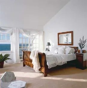
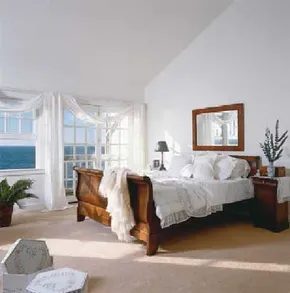
Start with the bedding. Snowy white linens are non-negotiable here. They keep the space light. Add simple window treatments. No heavy drapes. Just clean lines. This combo signals rest. It tells your brain to sleep.
Dark wood furniture is the anchor. Use it against cream or white walls. The contrast makes the pieces pop. You see the grain. You see the shape. Light walls expand the room. Dark wood grounds it.
Try a low-profile bed frame. Match the nightstands to the dresser. Keep surfaces clear. One lamp per side. That’s it.
Why This Palette Works
You might wonder why white and dark wood don’t clash. They don’t because they serve different roles. White reflects light. Dark wood absorbs it. Together they create depth.
This is not a minimalist void. It’s a layered look. The textures matter. Cotton sheets. Wooden legs. Maybe a woven rug.
Safety check. Ensure heavy furniture is anchored. Toppling hazards are real. Especially with kids or pets. Use anti-tip kits.
How to Replicate the Look
- Pick a wood tone. Walnut or dark oak works best.
- Paint walls off-white or cream.
- Buy white bedding with high thread count.
- Keep windows bare or use sheer panels.
- Limit decor to one or two items.
Avoid matching sets. They feel like a hotel. Mismatched tones add interest.
This approach is low maintenance. White shows dirt. Vacuum regularly. Spot clean spills immediately.
Is it worth the effort? For some, yes. The calm is tangible. You walk in and exhale.
Other styles demand more upkeep. Bohemian piles require dusting. Industrial metal can feel cold. This hybrid stays neutral. It fits most tastes.
Where to source materials? Thrift stores often have solid wood pieces. Refinish them. Sand down the old varnish. Stain dark. It’s cheaper than buying new.
Tools needed? A drill. Sandpaper. Paint brushes. A level. Simple stuff. No power saws required unless you’re cutting shelves.
Don’t overthink it. Start with the bed. Build outward. Let the space breathe.
The result is a room that feels edited. Not empty. Just intentional.
Some people need color to feel alive. You might need quiet. This setup provides both structure and softness.
It’s a specific vibe. Not for everyone. But if you want tradition without the fuss, it’s a solid path.
Keep it simple. The details accumulate. A vase here. A book there.
Eventually, it becomes yours.
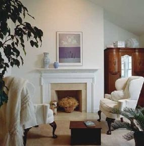
What’s the point of a bedroom if it doesn’t do the job? You don’t need a sprawling suite. Just a bed that invites deep sleep. An armoire with mirrors to stash clothes and electronics. Two wing chairs that actually support your spine. That’s the checklist.
The rest is noise.
Color is sparse here. A touch of pottery. A splash of porcelain. Art that whispers rather than shouts. It’s all there to mirror the sea view outside the window, not compete with it. The white mantel gets some architectural detailing—just enough to break up the monotony without looking fussy.
Soft carpet. Wall-to-wall. It pampers your bare feet when you stumble out in the morning. It dampens the sound of footsteps too. Quiet is a luxury most people forget to buy.
Why Minimalism Works for Coastal Retreats
People think “vacation home” means bright patterns and pineapple motifs. It doesn’t. It means space. Air. A lack of clutter that lets the eyes rest.
The sea view is the star. Your decor is just the frame.
“The porcelain, pottery, and art bring forth just a hint of color to complement the sea view.”
This approach works because it reduces decision fatigue. You walk into the room. You see white walls. You see the water. You sit in a wing chair. You breathe. That’s the whole point.
How to Replicate the Look Without the Vacation Budget
You don’t need to be in the Caribbean to get this vibe. You just need to be disciplined.
- Start with the floor. Install soft, neutral carpeting. Avoid hard surfaces in bedrooms if you want that “softened” feel.
- Edit your furniture. Keep it simple. A bed. A storage unit with mirrors (mirrors bounce light, making small spaces feel larger). Two chairs. That’s it.
- Limit the accent pieces. Pick three items. One pottery piece. One art print. One vase. Place them strategically. Don’t scatter them.
- Focus on texture. White mantel? Add molding. It’s cheap woodwork that adds character. Don’t paint over it with busy patterns.
Where to Find the Right Pieces
You’re looking for specific textures. Matte finishes. Natural fibers. Avoid glossy, plastic-looking decor.
- Mirrored Armoire: Look for vintage finds or modern pieces with beveled edges. The mirror reflects light; the wood adds warmth.
- Wing Chairs: These aren’t just for show. The high back contains heat. Good for reading. Good for napping.
- Porcelain & Pottery: Earth tones only. Blues, greens, sandy beiges. Nothing neon. Nothing primary red.
Decorating Styles That Fit This Mood
This isn’t just “coastal.” It’s a specific subset.
- Hamptons Chic: White walls, natural wood, crisp linens.
- Modern Minimalist: Clean lines, zero clutter, functional furniture.
- Tropical Escape: This is where the next section comes in. If you want to push the “island” theme further, you start adding more color, more plants, more texture.
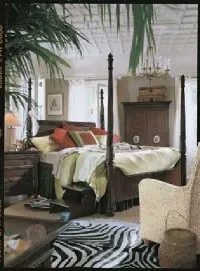
Dark, carved Colonial-style furniture doesn’t just stay stylish. It holds its ground.
This room proves that you don’t need to chase every fleeting trend to make a space feel current. The owners resisted the urge to overload the space with global influences. Instead, they kept everything controlled. Timeless.
The result is a bedroom that feels grounded rather than cluttered.
Balancing Global Elements Without Overpowering
You can bring in worldy touches without letting them steal the show.
Take the zebra-skin rug. It’s bold. It grabs attention. But it sits under the bed, grounding the space rather than dominating it. The same goes for the Asian-inspired woven baskets. They add texture and depth. They don’t monopolize the room.
The real stars here are different.
The bed is handsome. It’s dressed with an abundance of coverings and pillows that look well-planned, not thrown together. Above it hangs a romantic chandelier with glass shades. It catches the light. It adds softness.
But let’s talk about the architecture.
The room exudes elegance because of the built-in features. The ceiling has detail. It’s not just a flat white plane. Then there are the French doors. Three of them serve as windows, letting in light and framing the outside world.
Choosing a Neutral Foundation
The owners knew they had charm built into the bones of the house. So they let it shine.
They abandoned patterns. No busy wallpapers. No loud rugs.
Instead, they went simple.
- Curtains: Plain. Simple. They frame the French doors without competing with the view.
- Flooring: A casual sisal carpet. It’s natural. It’s tough. It fits the mood.
- Walls: The color of milky coffee. A warm neutral that ties everything together.
This neutral base allows the dark furniture and global accents to pop without clashing.
The Right Chair for the Job
You might think you need an ornate upholstered seat to match the Colonial bed.
You don’t.
A plain rattan chair works better here. It maintains the proper mood. It’s casual. It’s light. It offers an extra place to sit or just dream. It breaks up the heaviness of the dark wood without adding visual noise.
Next Steps for Your Bedroom
If this controlled global look appeals to you, keep reading.
The next section dives into an elegant Parisian bedroom theme. It’s a different vibe. But it shares that focus on timeless elegance over temporary trends.
More Decorating Inspiration
If you want to apply these principles to other rooms in your house, check out these guides:
- Kitchen Decorating Ideas
- Dining Room Decorating Ideas
- Bathroom Decorating Ideas
- Home Office Decorating Ideas
- Decorating Kids Rooms
- Home Decorating Tips
- Decorating Styles
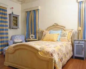
Blending Traditions with Modern Simplicity
French provincial style often gets pinned as overly romantic, but this bedroom proves it can be grounded in practicality. The vibe is upbeat, not stuffy. The bed anchors the space with a curvy silhouette and floral upholstery in a sun-warmed yellow. It is a traditional choice, as is the mix of pillow fabrics that offer support without sacrificing comfort.
But look closer at the windows. The glass doors are dressed in striped patterns—one horizontal, one vertical. This is where the style shifts. The stripes are modern. They are straightforward. They cut through the floral softness with clean lines.
Furniture here avoids the typical light painted finishes. Instead, the wall-mounted cupboard, nightstand, and desk feature a watery blue decorative finish. It matches the inviting chair tucked into the corner. The color ties the room together without overwhelming it.
Paring Down to Essentials
The floors are polished wood. They are left bare. This aligns with the current drive to reduce clutter. Accessories are minimal. You won’t find urns or artifacts cluttering the surfaces. Just family pictures and knickknacks that have been well-loved.
Lighting follows the same logic. A beautiful chandelier was skipped. The owners chose functional wall-mounted lamps instead. It is a pragmatic move. It saves space. It keeps the sightlines clear.
Transitioning to a Girl’s Space
Adult bedrooms set the tone. But switching gears requires a different approach. The next section explores how to create a pretty-in-pink paradise for a girl’s room. The ideas are practical. They focus on execution.
Before diving into that, consider the broader scope of home styling. Whether you are tackling the kitchen, dining room, or bathroom, the principles remain similar. Decorate with intent.
- Kitchen Decorating Ideas
- Dining Room Decorating Ideas
- Decorating Ideas
- Bathroom Decorating Ideas
- Home Office Decorating Ideas
- Decorate Home Spaces Ideas
- Interior Decorating
- Home Decorating Tips
- Decorating Kids Rooms
- Decorating Styles
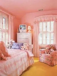
Pink works in any bedroom. But let’s be honest, a little girl’s room needs to outlast the toddler phase. That is why this space avoids the cliché of age-specific decor. The wallcovering features a tiny star pattern. It is subtle enough to serve as a neutral background when the dolls and storybooks are packed away. The aesthetic matures with the occupant.
White furniture is a strategic move for longevity. The dresser and bed are timeless. They can stay in place forever without looking out of place. Soft, feminine drapes pair with crisp white shutters. The result is enduring elegance. It hints at princess fantasies without crossing into babyish territory.
Sophistication Through Art
Gold-framed prints hang above the bookcase. They introduce a layer of sophistication. This wall collection is not static. As years pass, you can add to it. The sentimental value grows with the collection until it rivals the status of a favorite teddy bear.
A showstopping mural can add dramatic flair to any bedroom. If you are looking for high-impact visual changes, consider how to incorporate a mural into your own space.
For broader home decor strategies, explore these categories:
- Kitchen Decorating Ideas
- Dining Room Decorating Ideas
- Decorating Ideas
- Bathroom Decorating Ideas
- Home Office Decorating Ideas
- Decorate Home Spaces Ideas
- Interior Decorating
- Home Decorating Tips
- Decorating Kids Rooms
- Decorating Styles
Faux Painting Bedroom
If traditional wallpaper feels too permanent, faux painting offers texture and depth. This technique allows for custom color matching and unique finishes. It requires patience and the right tools.
Tools needed:
– Drop cloths
– Paint brushes and rollers
– Sponges or specialty faux-finish tools
– Drop cloth or plastic sheeting for floor protection
Safety first:
Always work in a well-ventilated room. Wear a mask if sanding or using strong fumes. Ensure ladders are stable before climbing.
The process:
Start with a base coat. Let it dry completely. Apply your glaze or secondary color using specific techniques to create depth. Test your technique on a sample board first. Mistakes are easier to fix on a small scale.
This approach allows for personalization. You can mimic wood grain, stone, or plaster. The result is a custom look that standard paint cannot achieve.
Explore more decorating styles and tips online to refine your approach. The goal is a space that feels both personal and polished.

The Ceiling That Changed the Room’s Gravity
Waking up is hard. A painting of clouds on the plaster above your head doesn’t fix the alarm clock. It doesn’t make the coffee brew itself. But it helps. Just a little.
This bedroom owner doesn’t have to imagine blue skies. They wake up to them every single morning. The mural covers the entire ceiling. Swirling white clouds against a bright, deep blue backdrop. It transforms an average-sized retreat into something else entirely. Magical. Distinct. The room feels larger than its square footage.
The rest of the decor grounds the fantasy. An iron bed sits in the center. It’s contemporary. Clean lines. Minimalist. But the palette tells a different story. The colors are old-world. Soft. Sensuous.
Look at the fabrics. The bedskirt is gathered, not straight. It has volume. The draperies hang heavy, framing the window. They add weight and warmth. The contrast works. The modern iron frame meets the romantic, textured textiles. The ceiling provides the escape. The floors keep you grounded.
It’s a specific aesthetic. Old-world sensibility with modern anchors. The ceiling is the star. But without those gathered fabrics and the iron frame, it would just be a sky. Now, it’s a bedroom. One that pulls you in.
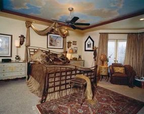
The scale changes everything.
Swapping out standard nightstands for oversized, hand-painted European chests of drawers does more than just fill space. It grounds the room. The visual weight of these pieces suggests history. It suggests a home that has been lived in, not just staged.
But scale isn’t the only lever you pull for that specific opulent feel.
Texture is the other half of the equation. You need layers. A chaotic, intentional heap of plush pillows creates a sense of abundance. Throws with a soft-to-the-touch finish invite contact. They break up the hard lines of furniture. This tactile interest is what turns a bedroom from a sleeping box into a sanctuary.
The goal isn’t perfection. It’s presence.
Don’t overlook the storage pieces. A decoratively painted armoire or cabinet acts as a silent mood-setter. It’s not just for clothes. It’s a statement piece. The paint adds depth. The silhouette adds drama.
And then there’s the floor.
Wall-to-wall carpet is a common default. It’s safe. It’s quiet. But it can feel flat. Laying an Oriental rug directly on top of it changes the geometry of the room. It creates a focal point. The rug injects color where walls and ceilings usually leave gaps. It adds another layer of texture underfoot.
This layering technique—chest as nightstand, rug over carpet, pile of throws—is how you add grandeur without touching the walls. You aren’t remodeling. You’re curating.
If you want to pull that same European flair into other parts of the house, the principles remain consistent. Scale, texture, and historical references.
How to Apply European Flair to Your Bedroom
You don’t need a budget for a full renovation to get this look. The trick lies in sourcing.
- Mix eras: Pair a vintage-style armoire with modern, clean-lined bedding. The contrast creates tension. Tension creates interest.
- Prioritize materials: Look for wood with character. Distressed finishes work best. Avoid perfectly smooth, factory-new surfaces.
- Layer lighting: European rooms often feel warmer because of lighting. Use bedside lamps with fabric shades. Avoid harsh overhead lights.
- The rug strategy: If you’re renting or can’t replace carpet, choose an Oriental-style rug with a high knot count. It needs to sit firmly on the floor. Anchor it with furniture legs if needed.
Where to Find These Pieces
You won’t find these at big-box stores.
- Antique shops: This is where you find the hand-painted chests. Look for damage that can be polished out.
- Auction houses: Good for the armoires. Check for structural integrity before bidding.
- Online marketplaces: Facebook Marketplace and Craigslist are goldmines for oversized furniture. You’ll find people giving away chests of drawers just to clear space. Take them. Sand them. Paint them.
- Textile markets: For the pillows and throws, visit local textile vendors. You want natural fibers. Wool and cotton. Not synthetic blends.
Why This Approach Works
Modern minimalism has its place. But it can feel sterile.
The European style, particularly the grander variants, embraces clutter in a controlled way. It’s not
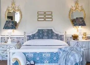
Crafting a Gender-Neutral Swedish Retreat
This bedroom leans heavily into traditional femininity, but the underlying design language is robust enough to hold its own against any masculine energy. It isn’t cluttered or overly sweet. The secret lies in the meticulous attention to detail. It strips away the froufrou to reveal something cleaner, more elegant, and distinctly Swedish.
You can recreate this vibe without buying a new room full of furniture. It starts with a specific palette. Stick to blue and white. Use it for walls, bedding, or curtains. Keep the light-painted furnishings simple. White wood or pale oak. Avoid heavy, dark stains. They kill the airy feeling you want.
Then, add gold accents. Just a little. Think mirrors. Picture frames. Lamps. A foot stool you gild yourself. The metallic touch grounds the space. It prevents the blue and white from feeling sterile or cold. It adds warmth without adding visual noise.
Why This Combo Works
Why does this specific mix feel so high-end? It’s about contrast. The cool blue and white create a calm, expansive backdrop. The gold provides focal points. Your eye jumps from one detail to the next. It keeps the room interesting without feeling busy.
This approach works for anyone. Men can take the blue and white base and use the gold accents sparingly. It becomes sophisticated. Not soft. Just refined. The Swedish influence brings in functionality. Every piece has a purpose. Nothing is just there for decoration.
How to Execute the Look
Start with the walls. Paint them a soft blue or keep them stark white. White is safer if you’re unsure. It reflects light. Makes the room feel bigger. If you go blue, pick a pale tone. Not navy. Not sky blue. Something muted. Like a faded linen.
For furniture, look for light wood. Pine or birch. Paint it white if you have to. The key is to keep it light. Heavy dark wood will drag the room down. It will make the gold accents look tacky instead of elegant.
Now, the accents. This is where you customize. Buy a cheap gold mirror. Or make one. Gild a simple frame yourself. It’s a quick weekend project. You don’t need to be an artist. Just follow a tutorial. Use gold leaf or metallic paint. The texture matters more than perfection.
Lamps are another easy win. Look for brass bases. Or spray paint old ones. Add a white shade. The combination of brass and white is classic. It never goes out of style. It fits the Swedish aesthetic perfectly.
Safety and Practicality
If you’re gilding something yourself, be careful. Gold leaf is thin. Fragile. It tears easily. Work in a draft-free area. Dust is the enemy. It will ruin the finish. Use a good adhesive primer. Follow the instructions. Don’t rush.
Wear a mask if you’re using spray paint. Ventilate the room. Gold spray paint can be potent. It’s not just about the look. It’s about not inhaling chemicals in a small, enclosed space.
Choosing the Right Materials
Which materials work best for this style? Cotton and linen for textiles. They breathe. They feel natural. Avoid synthetic blends that shine too much. They look cheap against the matte gold and white wood.
For the gold accents, brass is
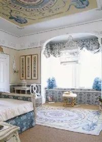
High ceilings can feel vast. Empty. Cold. Unless you break them up.
The trick here is marriage. Decorative paint meets wallpaper on the walls. This combo shortens the visual height of the room. It pulls the eye down. Makes the space feel intimate rather than cavernous.
Pattern does the heavy lifting too. Look at the window seat. The upholstered bed. The generous balloon shade. The repeated motifs tie it all together. It creates a rhythm. A cozy rhythm.
But the real showstopper? The painted ceiling.
It’s not an accident that the rug matches. It sits layered over a sisal carpet base. The colors echo the ceiling’s design. These details matter. They transform a grand bedroom into something remarkably pretty.
Details are what make a space feel designed, not just decorated.
This approach works because it layers textures and colors intentionally. You aren’t just picking a color. You’re building a visual hierarchy.
Why Ceiling Details Matter More Than You Think
Most homeowners ignore the fifth wall. The ceiling.
In this setup, it’s the focal point. The paint draws attention upward. But the wall treatment grounds it. The balance prevents the room from feeling like a museum.
If you’re tackling a similar space, start with the sisal. It’s durable. Natural. It provides a neutral base for the rug. Then layer your area rug. Choose something that picks up hues from your wall or ceiling work.
The Seaworthy Alternative
Not everyone wants a painted ceiling masterpiece.
Sometimes you need a different vibe. A theme that feels grounded. Seaworthy décor offers that contrast. It shifts the energy from grand to nautical. From formal to relaxed.
We’ll explore that direction next. But for now, notice how the pattern repetition creates cohesion. The balloon shade isn’t just lighting. It’s a structural element that fills the vertical space.
Practical Steps for the DIYer
If you want this look, you need tools. And patience.
- Prep the walls. Patch any holes. Sand smooth.
- Apply wallpaper. Use a level. Overlap patterns carefully.
- Paint the ceiling. Use a roller for large areas. A brush for edges.
- Layer textiles. Sisal first. Rug second.
Safety matters. Ladders. Drop cloths. Proper ventilation for paint fumes.
The result? A room that feels curated. Not cluttered. Every piece has a reason.
Choosing the Right Bedroom Decor Theme
Themes shouldn’t dictate your comfort. They should enhance it.
This bedroom works because it’s layered. Paint. Paper. Fabric. Texture. It’s not one bold stroke. It’s a symphony of small choices.
When you pick your theme, ask yourself: What makes me feel calm? What makes me feel enclosed?
In this case, the answer was shortening the walls. Adding warmth.
The next section takes you in a different direction. Seaworthy décor. But the principle remains. Intent. Layering. Detail.
Home decoration is rarely about one big change. It’s about the accumulation of small, deliberate decisions.
Which wall will you tackle first?
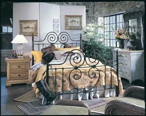
Why a Specific Theme Works Better Than a Scattergun Approach
Start with a focal point. A theme isn’t just a vibe you guess at. It is a concrete anchor that stops the “too much” feeling from creeping in. Take the fish motif. It works because it is specific. You don’t just pick “water colors.” You pick fish.
That single decision dictates everything else.
The dresser gets the pattern. The walls get the pattern. Even the throw pillows get pulled into the orbit. This creates a rhythm. Your eye moves from surface to surface and finds the same element. It feels intentional. It feels designed.
Without that anchor, you are just stacking random decor items. With it, you are building a scene.
How to Execute a Theme Without Looking Like a Novelty Shop
The risk with any theme is the “theme park” effect. You want sophisticated, not kitsch.
- Vary the scale. Don’t use the same fish image on the dresser and the pillow. If the dresser has small, intricate fish, use larger, bolder ones on the wall art.
- Change the medium. The dresser might have a stencil. The wall could be a mural or wallpaper. The pillows are fabric. This keeps the eye interested.
- Use neutrals to ground it. If your fish are bright blue, keep the rest of the room in crisp whites, sandy beiges, or deep navy. Let the theme pop against a calm background.
This approach prevents the room from feeling like a costume. It stays wearable. It stays livable.
Where to Find and Apply These Elements
You don’t need custom furniture. Look for:
- Decals: Quick, renter-friendly way to put fish on walls without committing to paint.
- Stencils: For the dresser. Use a fine-tip brush to avoid bleeding.
- Textiles: Search for “marine life” or “aquatic” patterns on fabric sites. Not just “fish.”
The key is repetition. But not exact repetition. Similarity.
If you stick to the theme too tightly, it feels forced. If you ignore it, it feels accidental. The sweet spot is somewhere in between. You see the fish everywhere, but you also see the room breathing.
Tools and Materials You Will Need
Grab these before you start:
- High-quality painter’s tape.
- A level.
- A fine-tip stencil brush.
- Acrylic paint that matches your theme colors.
- A steamer for removing old wallpaper if you are changing wall treatments.
Safety first. Work in a ventilated area. Wear a mask if you are sanding surfaces before applying decals or paint.
Common Mistakes to Avoid
Don’t put the theme on every surface in equal weight. It overwhelms the space.
Don’t use too many colors. Stick to a palette. If your theme is goldfish, use orange, white, and black. Don’t add purple.
Don’t forget the lighting. Fish look different under warm light. Test your decor under the actual bulbs in the room before finalizing placement.
This is just the start. The theme is the skeleton. The next step is fleshing it out with texture. But that is for later. For now,
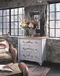
Forget the rigid gender stereotypes. This space works for anyone who values comfort over cliché. The rough-hewn stone walls and leaded glass windows pull the eye toward old-world charm. Think of a secluded cottage where the only noise is wind in the trees.
The cool gray tone of the masonry acts as a neutral canvas. Against it, the bedspread bursts with sunny warmth. It’s an inviting spot to linger. You wouldn’t mind staying in that bed all day. The woven rattan chair sits quietly nearby. It balances the rugged architecture with a touch of organic softness.
Flooring here defies the standard single-rug rule. The layering of two diverse carpets creates depth. It makes the room feel grounded. Add a large mirror in a folk art frame. It bounces light around the corners. Fresh flowers with a heady scent complete the sensory experience. The result is a timeless sanctuary.
Most of us want our bedroom to be a relaxing retreat.
Try incorporating these decorating ideas for a warm, casual bedroom setting.
Where to Find More Home Decor Inspiration
If you need more decorating ideas as well as tips and information on decorating your home, visit:
- Kitchen Decorating Ideas
- Dining Room Decorating Ideas
- Decorating Ideas
- Bathroom Decorating Ideas
- Home Office Decorating Ideas
- Decorate Home Spaces Ideas
- Interior Decorating
- Home Decorating Tips
- Decorating Kids Rooms
- Decorating Styles
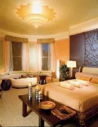
Global bedroom decor on a budget
The trick to making a small room feel massive is layering textures that shouldn’t work together but do. Take this persimmon-walled bedroom. It’s intense. Most people would pick up the phone to call a contractor to paint over it immediately. But the result is a mood, not just a color scheme.
The walls set the tone. Hot. Persimmon. Then you echo that heat in the bedding. Silk pillows. The same orange hue in the coverlet. It creates a loop. Your eye doesn’t get a break. You need the sea-grass rug to ground it. Coarse texture against the smooth silk. It tempers the warmth.
Then there are the window treatments. Sheers dropping like wings. They let light in but diffuse it. No harsh shadows. Just soft diffusion.
Lighting matters. A sunburst fixture overhead. It’s not just a lamp. It’s a focal point. It radiates. But you need contrast. That’s where the silvery candle holders come in. They introduce coolness. A bit of metallic sheen to break up the earth tones. It raises the energy level of the room. Without it, the space feels heavy. Stagnant.
Look at the accessories. The ottoman. Pottery dishes. Lacquered trays. They bask in the heat. But the stones? Those change everything. Each one set in its own dish. Individual. Deliberate. It’s a collection. Not just clutter. It adds an exotic layer. You walk in and you don’t just see a bedroom. You see a destination.
The African-like stools and sculpture push the theme further. It’s globally inspired design. It doesn’t look mass-produced. It looks curated.
If your own bedroom feels flat, try stealing from this playbook. You don’t need to paint your walls persimmon. But you can use color repetition. Pick one bold hue. Use it in soft furnishings. Then neutralize it with natural textures. Sea grass. Stone. Silver.
The goal isn’t perfection. It’s atmosphere.
“The bedroom becomes even more exotic with the collection of stones, each set in an individual dish.”
Start small. Maybe just the rug. Then the pillows. See how the light hits them. Adjust from there. Don’t overthink the sourcing. Thrift stores often have the lacquered trays or the pottery. You’re looking for character, not newness.
This approach works for a study too. Or a guest room that needs to pop. The principles are the same. Color repetition. Texture contrast. Cool accents to balance heat.
You can find more inspiration if you look at other spaces. Kitchen decor often uses similar bold backsplashes. Dining rooms rely on those same textured rugs. It’s all connected. The same logic applies to bathrooms too. Cool tiles against warm wood.
The point is to stop decorating each room in isolation. Start seeing the thread that connects them. Your bedroom doesn’t have to be a sanctuary of beige. It can be a statement.
Go back to the source. Look at how they handled the light fixtures. Notice the sheers. Then go make it yours.